Fun with PhotoBooth

Happy spring everyone! The weather had finally changed, and winter is gone. Allergy season is right around the corner! Although it feels like winter dragged on far too long this year, even with global warming, it also feels like time has flown by, that it was just the holidays and I just started my new job. But I’ve been there coming on three months now.

The big activity last weekend was getting the yard ready for spring, part one. Or another way of saying it, the start of yardwork season. I had wanted to start the weekend before, but it seemed pointless as there was still piles of melting snow on our lawn. And the weekend before that we spent the whole time shoveling. In any event we made good start. Raked off all the debris, and I filled in some low spots in the back corner which are prone to flooding with dirt. Not particularly creative, but it’s constructive at least. I have a project in the offing to re-level the patio I made 3 years ago, as the stones have begun to heave and settle in one corner. I think when I get around to that I’ll blog about building the patio, since it was a creative project and a major effort.

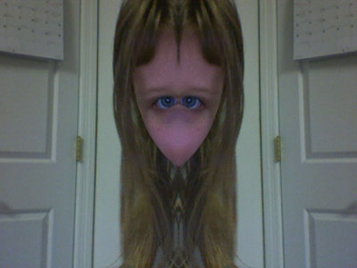
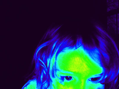
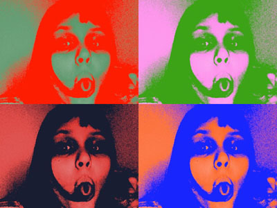
Meanwhile the main topic for today is fun with PhotoBooth. A few weeks ago Jeannie brought home one of those MacBook Pro computers from work, the ones with a built-in camera and a cute little app called photo booth. You gotta hand it to Apple, they’re good at making computers fun, and this app is a good example of that. Not a lot of depth to it, but easy to use and engaging. Let’s you take pictures of yourself (or whatever else is in front of the computer), with some cool realtime effects. It’s the kind of thing we might have made at Interval Research back in the 90’s.

The girls really got into it, and Lizzy in particular, who likes photography to begin with, explored the creative dimension. She took over 400 pictures. Presented here is a gallery of some of our favorites.

GE Music Player

My good friend Erik runs a recording studio and music production house in the city called GE Music, after him and his partner Glenn. Recently he asked me to design and build in interactive music browser / player as a way to present his scores and tracks to clients, potential clients, and casual listeners. It was a fun project because I could do all the development functions my self, including visual and interaction design as well as programming. As of last night the application programming is done, and the thing is pretty cool if I say so myself. Here’s a screen grab of a test deployment on my server.

Of course a static screen grab doesn’t really do it justice. The site integration and live deployment remains to be done. So watch this space, and soon I’ll post a link to the player living in it’s natural environment, serving Glenn and Erik’s awesome tracks!

Blast From the Past: Talking Head

I’m on a mailing list for my old school, and the topic came up of if there are any good online text-to-speech tools. Someone posted this link. Wow, I thought. I immediately recognized the application.

Back in 2001 I worked for a little internet startup called Oddcast Entertainment. I was one of the main developers for an online character application, a prototype that we were fashioning into a product, complete with end-user authoring tools. One of the first things I did was integrate a text-to-speech engine into the system, and as a proof-of-concept I made a demo, which, although re-skinned, is essentially what you see here. I always thought it was a cool little thing that shows off the technology, and is fun and interactive in the sense that you get to hear it say what you type. My original version had a much larger text entry box, and I used to test it on the poetry of Robert Frost and Lewis Carroll. On the way to being productized, the text to speech part was buried in a much larger feature set, and I did not know they kept around a link to this app. So I’m happy to have found this page.

Origami Polyhedra: The Stellated Dodecahedron Part 2

A little while ago I posted some pictures of Stellated Dodecahedra I made in origami. Here the crease patterns for them. You see, in addition to folding origami, I’ve taken an interest in diagramming, and someday I hope to publish a book of my models. But I find diagramming so laborious that I only do one model a year! (Although they do tend to be pretty complex models.) I’ve also been developing crease patterns, which is particularly useful for polyhedra and other complex subjects where there is a lot of prefolding.

I do my diagramming and CP’s in Flash, and I’m not aware of other people doing this. One reason is I use Flash a lot in my day job, so I know it and can work in it quickly. Another is that I can use to make animated diagrams and CP’s. You can see some of them on my main origami page. This is an experimental format which I am refining over time. It had its origin in the Foldinator Project. Foldinator was originally envisioned as a full-on authoring tool for modeling origami and creating printable diagrams. However, to get there is a rather major development effort. So instead I wound up with this little hacker-level tool that I use. I still hope to finish and release Foldinator someday, but I’d need to treat it like a professional software development project and devote something like 6 months to a year of full-time work to it. Ah well, maybe if I’m lucky I can do like Robert Lang and retire young to do origami full-time.

Meanwhile, you can see the various approaches for the Stellated Dodecahedron.

Here is the one made from two squares. As you can see it’s the simplest of the bunch.

Next up is the one folded from a 2:1 rectangle. This one is remarkably efficient in it’s use of paper, to the point where I had to set it into a larger area to have paper to do the joining. It’s also kind of cool because it has a sort of zigzag layout. I plan to publish an animated CP of this one shortly.

Lastly is the “classic” version, from a single square. This is foldable but very difficult. I like the CP a lot because of the way the layout maximizes the root pentagon and underlying square. Vertices of the finishes form touch 3 edges of the paper. This one would be a good for an animated CP as well.